| Written: 24/8/2015 | Introducing our Mobile Friendly Website |
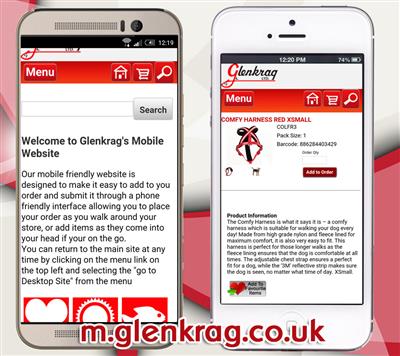
| To keep up with shifting trends in internet usage we have designed a mobile friendly version of our website to make it even easier to browse products, order products and now even show products to your customers all from your mobile or tablet. Some key benefits - Our mobile site has been designed to be minimalistic to reduce page sizes, loading times and data usage - Our mobile site fits to the width of your devices screen, no more scrolling left and right to read text if you`ve been using our desktop site on your phone - Our mobile site is integrated with our desktop site, you can add an item to your basket on your phone and it will be in your basket on your desktop computer ideal for adding items on the move and your remember them. - Our mobile site has a "hide pricing" feature*, ideal for showing your customer an item on your phone or tablet without them seeing your costs. - Our mobile site has a touchscreen friendly interface to make it as easy as possible to navigate the website We know that the last thing anyone needs when they are trying to rush an order is to have an enforced change of the website they are used to, so rather than us redirect your phone or tablet to the mobile site, here is the address to of our mobile website and you can try it and bookmark it at your own leisure. To visit out mobile friendly site go to http://m.glenkrag.co.uk on your phone or tablet. * To use the "Hide Pricing" feature, go to the home page of the mobile website and click on "Click Here to Hide/ Show Pricing" link at the bottom of the page, to turn pricing back on visit the page again. Visit Our Mobile Site Here |
 |